Ringling1.png

Rebranding Ringling Brothers

The Ringling Bros. and Barnum & Bailey brand is an American icon, creating excitement and capturing imaginations for more than 150 years. After a five-year hiatus, it returned in 2022 with a reimagined experience that puts the focus on human performers instead of animals. VMLY&R's modern brand system took inspiration from the idea of performance—the very essence of the Ringling experience—and the rich history of circus poster vernacular. We updated their logo and font for eminent readability and excitement, and used circles throughout the system to connect generations of Ringling symbology. Every piece of the brand brings to life all the energy and emotion one can only find in a Ringling show.


The Design Story

For 150 years, The Ringling Brothers Circus entertained America. Now, the circus is reinventing itself without the icons that made it famous. How do we leave behind the past and bring to life the essence of “The Greatest Show on Earth”?


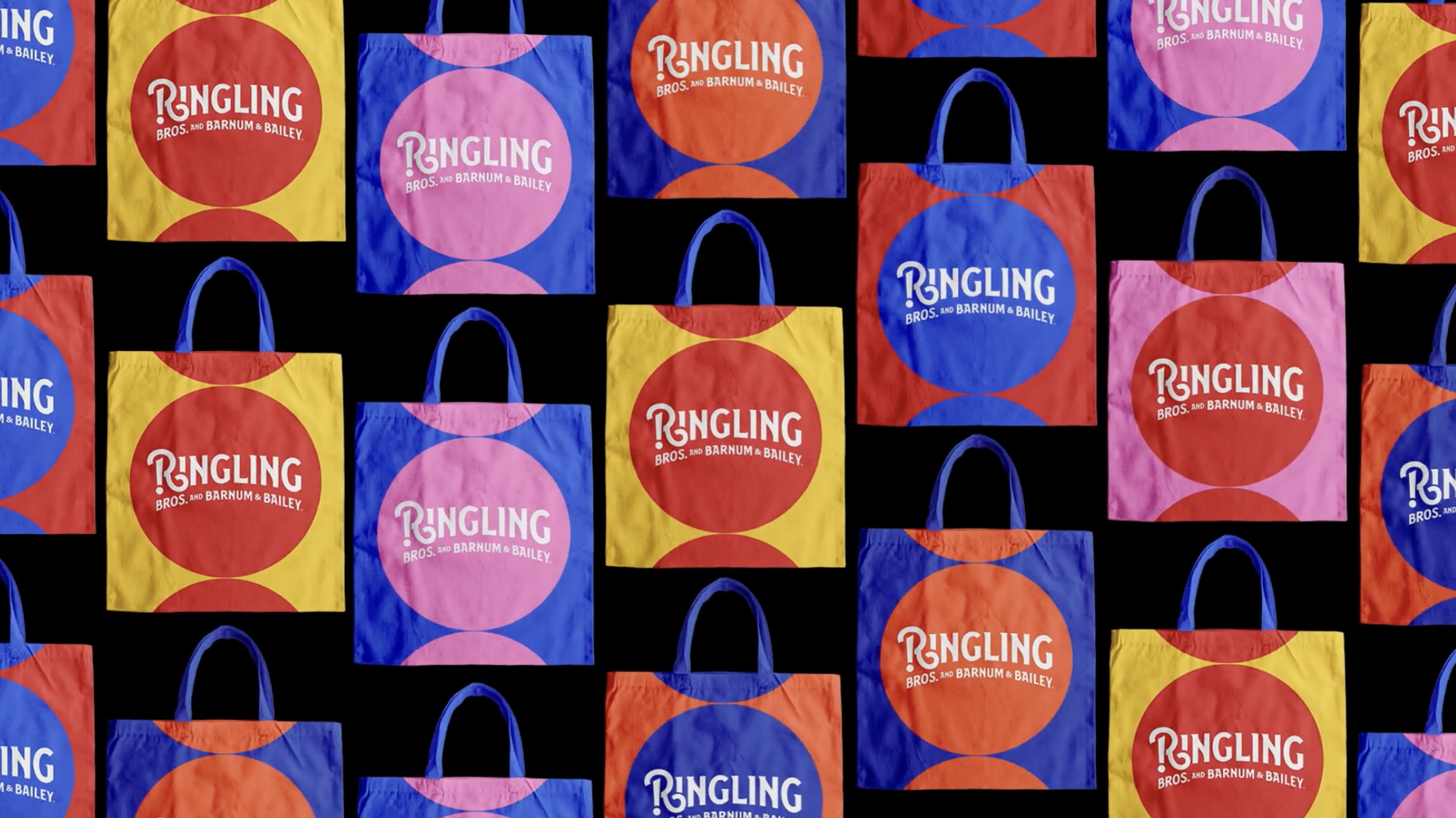
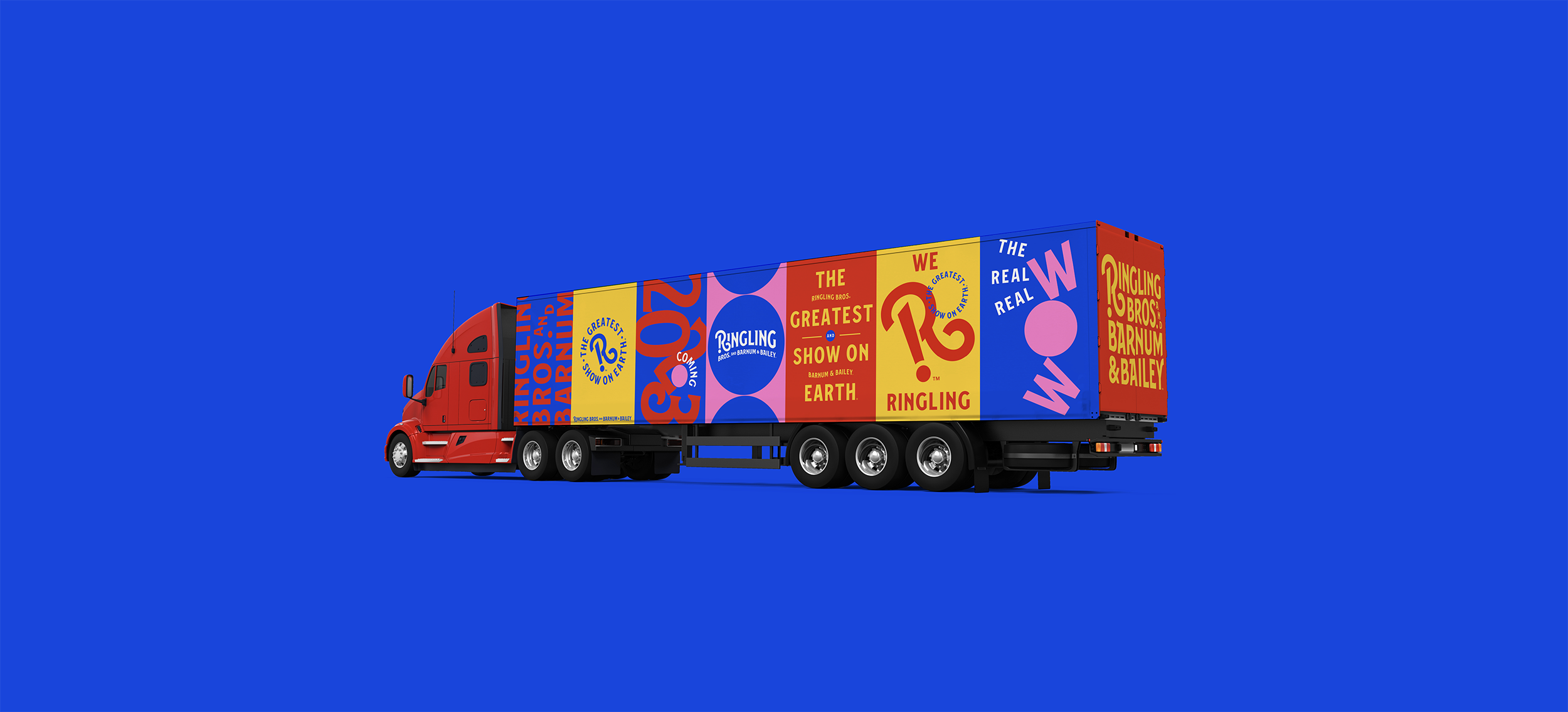
Not just one logo, but a set made for any situation.

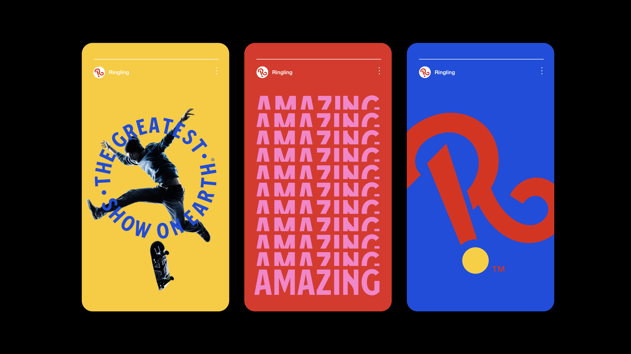
The logo system can be used in different ways depending on application. Illustrated here is what we call the “volume knob.” Turn it up for the full name or it turn it down to the simplest version: the icon. 


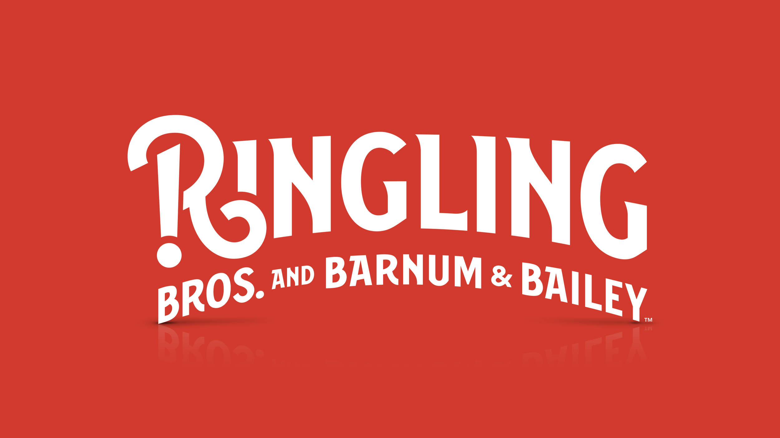
We call this the Wow Point. The R of The Wow Point was inspired by the curled R’s used in the past. It’s been reimagined and drawn to account for various sizes and formats.


A bold new brand identity that doesn’t just communicate,
it performs.


Custom Typeface Based on Historical Letterforms