The Before State
The brand language of Dell had become lost in a sea of sameness of consumer retail ubiquity, which ultimately undermined the B2B transformation the business had been thriving under for years.

The After State
The bold and colorful new graphic language brings to life the core strategic essence of the brand, Ever Forward – which posits that all human progress and innovation is the product of iterative small steps. This new branded language not only brings that to life, but positions Dell in a significantly more modern and fresh way.

The Dell Element and Ever Forward
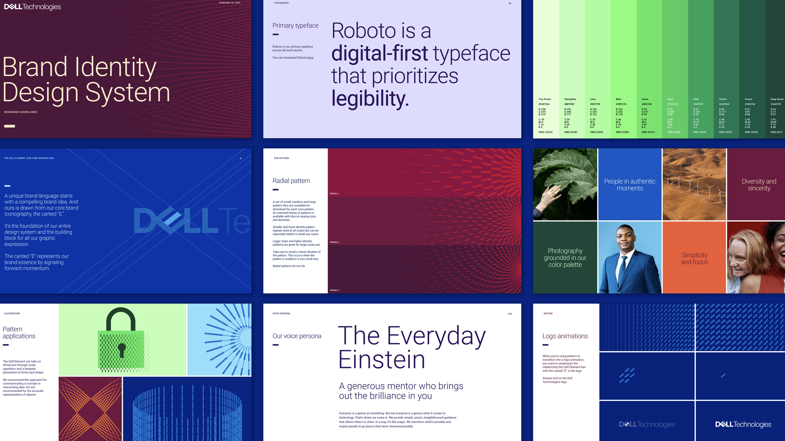
A unique brand language starts with a compelling brand idea. And ours is drawn from our core brand iconography, the canted “E.” It’s the foundation of our entire design system and the building block for all our graphic expression. The canted “E” represents our brand essence by signaling forward momentum.


A unique brand language starts with a compelling brand idea. And ours is drawn from our core brand iconography, the canted “E.” It’s the foundation of our entire design system and the building block for all our graphic expression. The canted “E” represents our brand essence by signaling forward momentum.