Watch the case study below.
The Design Story
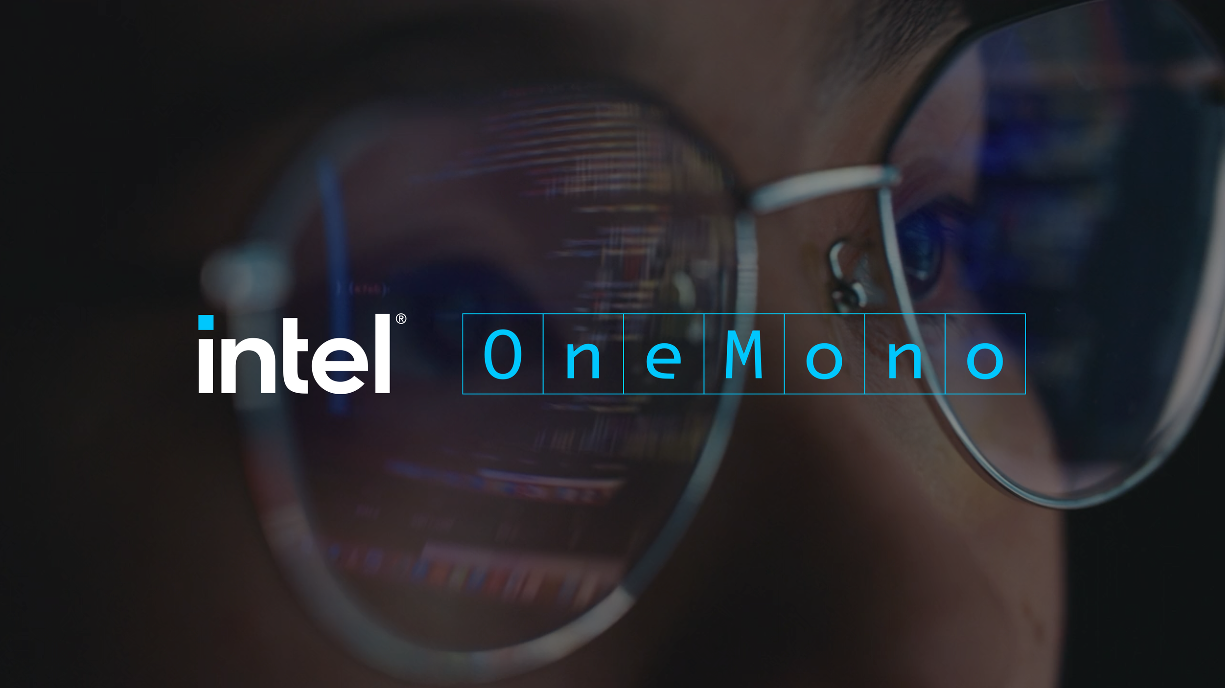
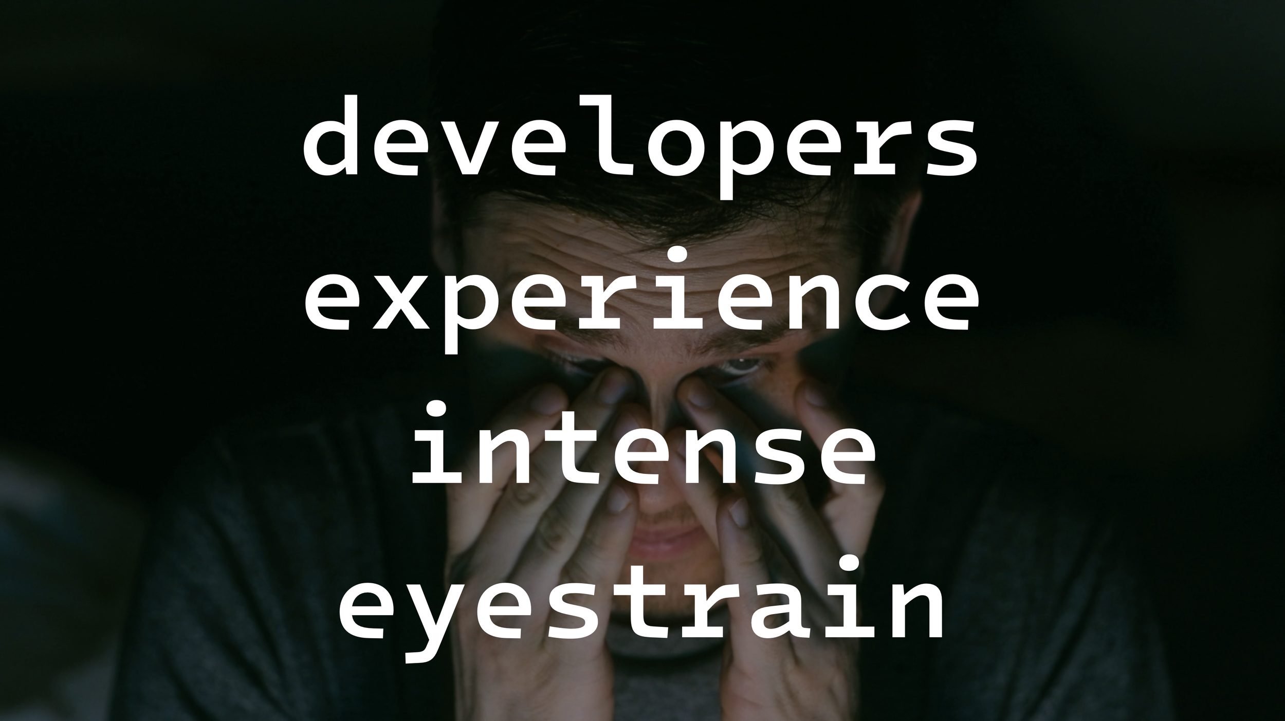
It is a priority for Intel to support and engage one of its core affinity audiences, the software developer. In strategizing an approach to develop a monospace coding typeface, we realized that there was a lack of innovation and consideration of font design for developers. And considering they are one of the most intense screen users, creating a font that addressed that became our number one priority.


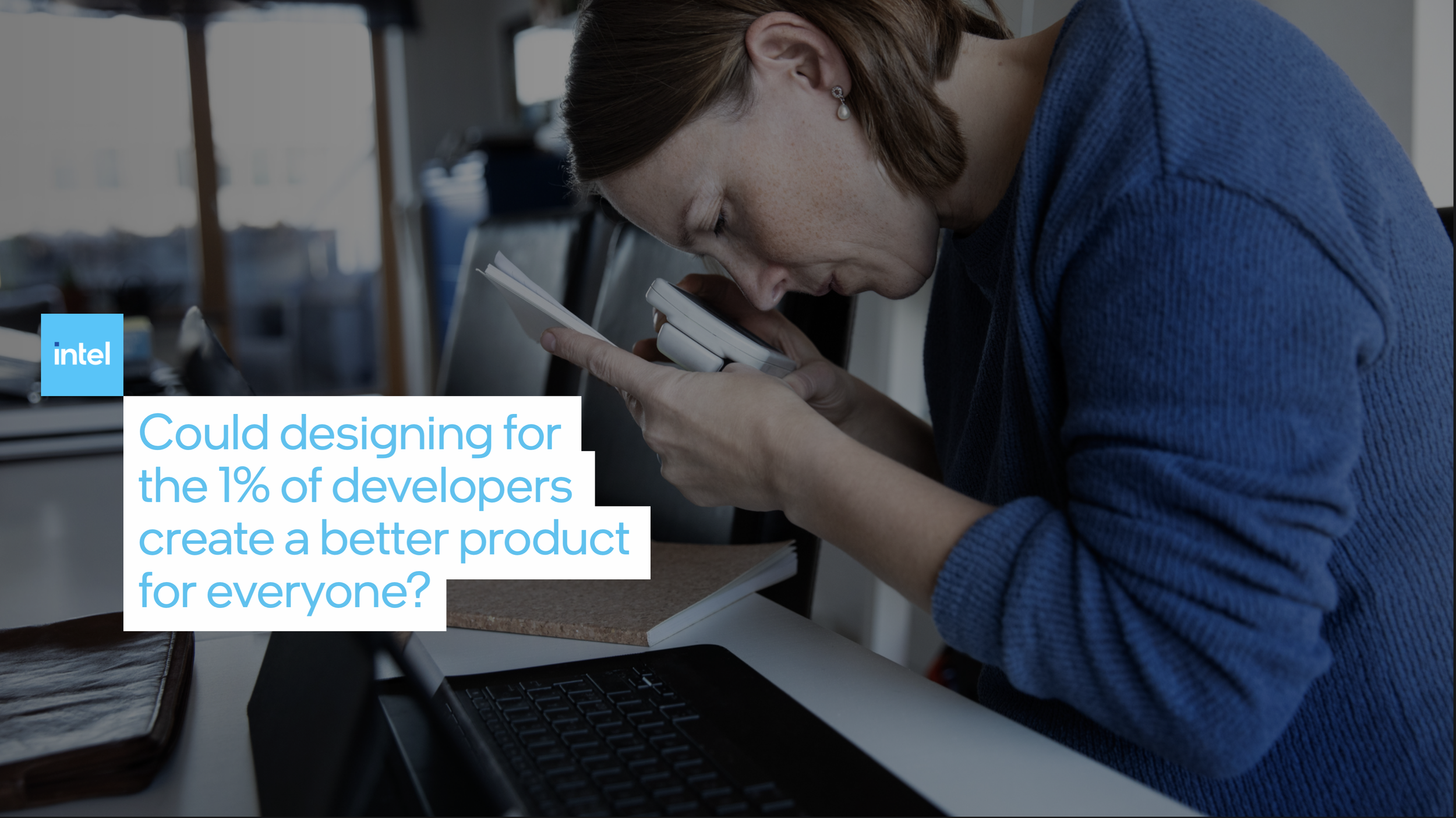
Collaborating with low vision developers, we unearthed unexpected design innovations.
When championing legibility and the rapid scanning of a heavily mixed character set of letterforms, numbers and special characters that a developer confronts on a daily basis, we learned that visual disruption is far more important than the traditional notions of harmony and consistency that dominates most font design approaches.


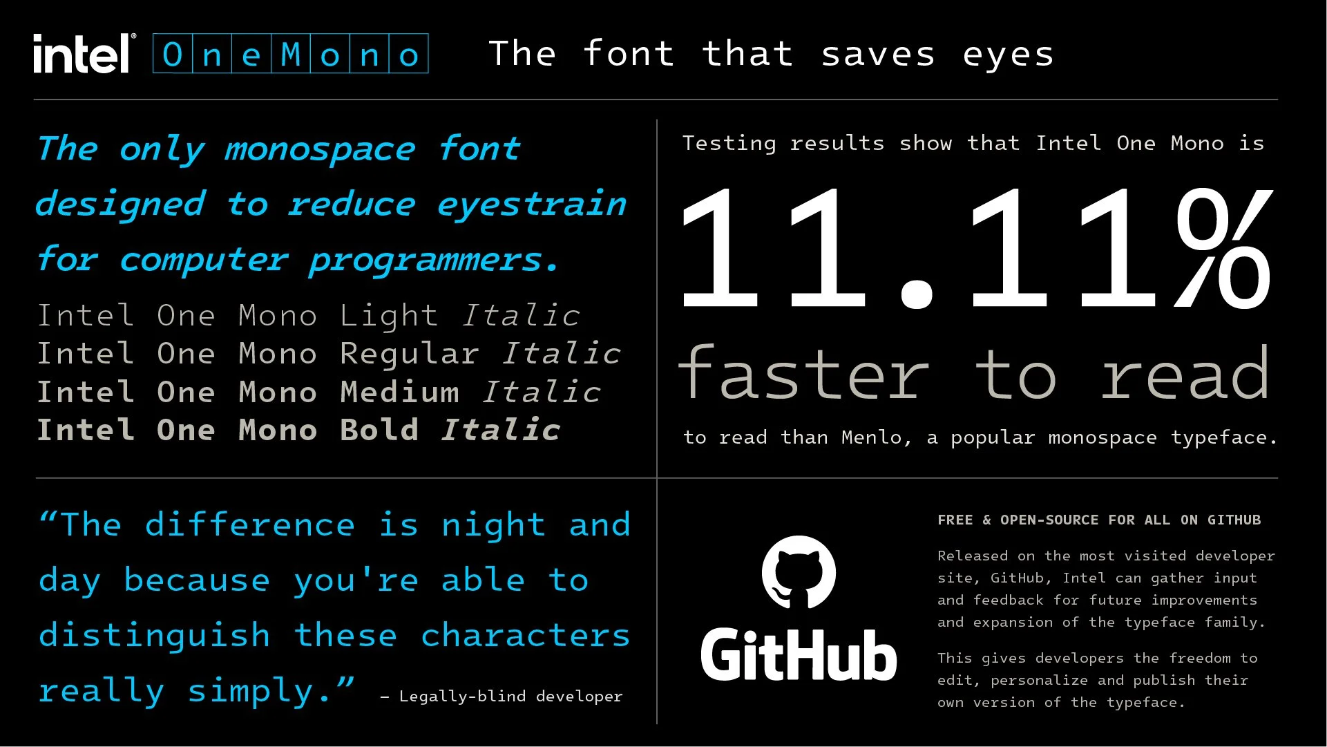
Sometimes, Beauty and Harmony has little to do with good design
At first, the unusual design of Intel One Mono was received with a mix of repulsion and comedic trolling.

The chat board uproar started to gain the attention of tech and developer press outlets.

And received high volumes of organic downloads with no marketing spend.

As more people downloaded Intel ONe Mono, the true power of the unusual design appraoch became more evident.